Graph Examples - Protein Interaction dataset(minimized)#
Import cuxfilter#
[1]:
import cuxfilter
import cudf
import cugraph

ITERATIONS = 500
THETA = 1.0
OPTIMIZE = True
Load required datasets#
[ ]:
edges = cudf.read_csv(
    "./data/edges.csv",
)[["Source", "Destination", "edgeColor"]]
nodes = cudf.read_csv(
    "./data/nodes.csv",
)[["x", "y", "SYMBOL", "Color"]]
nodes.Color = nodes.Color - nodes.Color.min()
[ ]:
nodes.head()
[ ]:
edges.head()
preprocess the data#
[ ]:
edges.columns = ["source", "destination", "color"]

G = cugraph.Graph()
G.from_cudf_edgelist(edges)

nodes_ = cugraph.layout.force_atlas2(
    G,
    max_iter=500,
    strong_gravity_mode=False,
    outbound_attraction_distribution=True,
    lin_log_mode=False,
    barnes_hut_optimize=OPTIMIZE,
    barnes_hut_theta=THETA,
    verbose=True,
)
[ ]:
nodes_1 = nodes_.merge(
    nodes, left_on="vertex", right_on="SYMBOL", suffixes=("", "_y")
)[list(nodes.columns)]
[ ]:
nodes_1.head()
Define charts#
[ ]:
cux_df = cuxfilter.DataFrame.load_graph((nodes_1, edges))
[ ]:
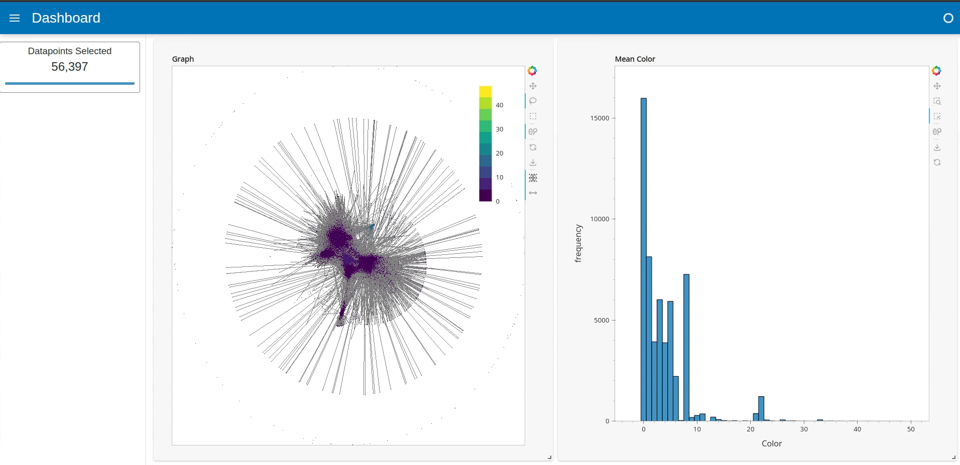
chart0 = cuxfilter.charts.graph(
    edge_target="destination",
    edge_color_palette=["gray", "black"],
    node_id="SYMBOL",
    timeout=200,
    edge_aggregate_col="color",
    node_aggregate_col="Color",
    node_aggregate_fn="mean",
    node_pixel_shade_type="linear",
    edge_render_type="direct",  # other option available -> 'curved'
    edge_transparency=0.5,
    unselected_alpha=0.2,
)

chart1 = cuxfilter.charts.bar("Color", title="Mean Color")
Create a dashboard object#
[ ]:
d = cux_df.dashboard([chart0, chart1], layout=cuxfilter.layouts.double_feature)
Starting the dashboard#
d.show(‘current_notebook_url:current_notebook_port’) remote dashboard
d.app() inline within the notebook cell
Incase you need to stop the server:
d.stop()
[ ]:
d.show()
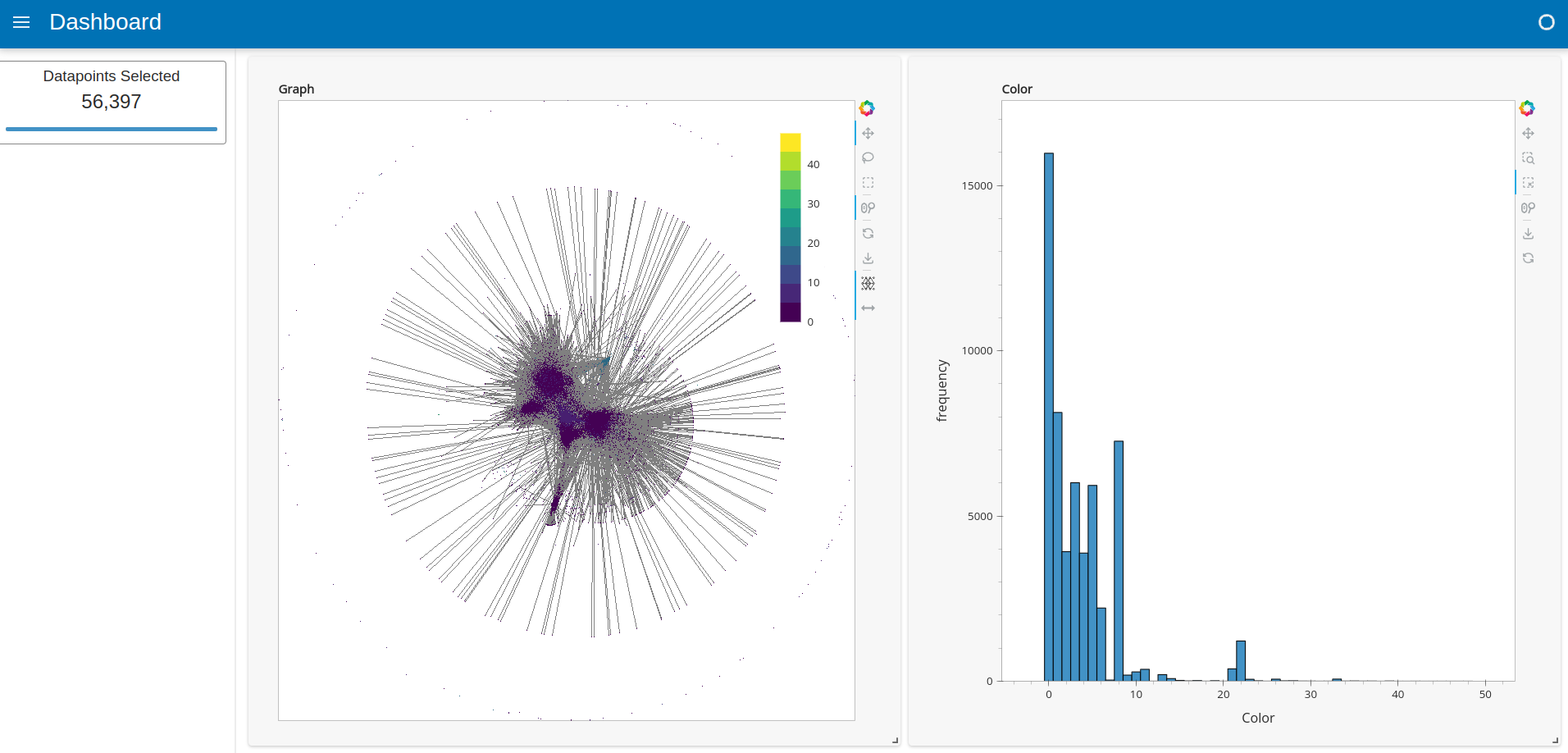
Graph charts introduce two new custom tools:#
Display Edges: Sometimes rendered edges can completely obscure the nodes in the graph, and also slow down the dashboard. The “Display Edges” tool allows the user to toggle the visibility of the edges in the graph.
Inspect Neighboring Edges: The “Inspect Neighboring Edges” tool allows the user to select a node in the graph and highlight the edges that are connected to that node. This is useful for exploring the graph structure around a particular node.
Note: Edge rendering support is limited for now, and there could be performance issues for large graphs with more than a million edges, while node rendering can go up to tens of millions of nodes. For large graphs, we recommend disabling edge rendering using the “Display Edges” toggle.
Export the queried data into a dataframe#
[ ]:
queried_df = d.export()